


Reimagining
Yolo
A Gen Z financial app that actually feels Gen Z
Client
areeba
Timeline
12 Months
role
Product Design Lead
project
Yolo
TL;DR
I led a full rebrand and product redesign for YOLO, transforming it from a generic wallet into a Gen Z-first financial tool. Although it wasn’t launched, it became a benchmark for what youth-focused design could look like.
Summary
YOLO was supposed to be a wallet for teens, but it lacked identity and relevance. I led a 1-week design sprint to completely reimagine its brand, UX, and product strategy to make it resonate with both teens and parents—and position it for long-term retention.
Problem Framing
The existing product felt generic and outdated. It didn’t speak to Gen Z visually, emotionally, or functionally. There was no clear parent-child dynamic, and the brand felt more fintech than fun. Internally, no one was proud of it—and usage showed.
- Poor visual identity and irrelevant tone of voice
- Confusing features and no clear product narrative
- No differentiation from existing areeba products
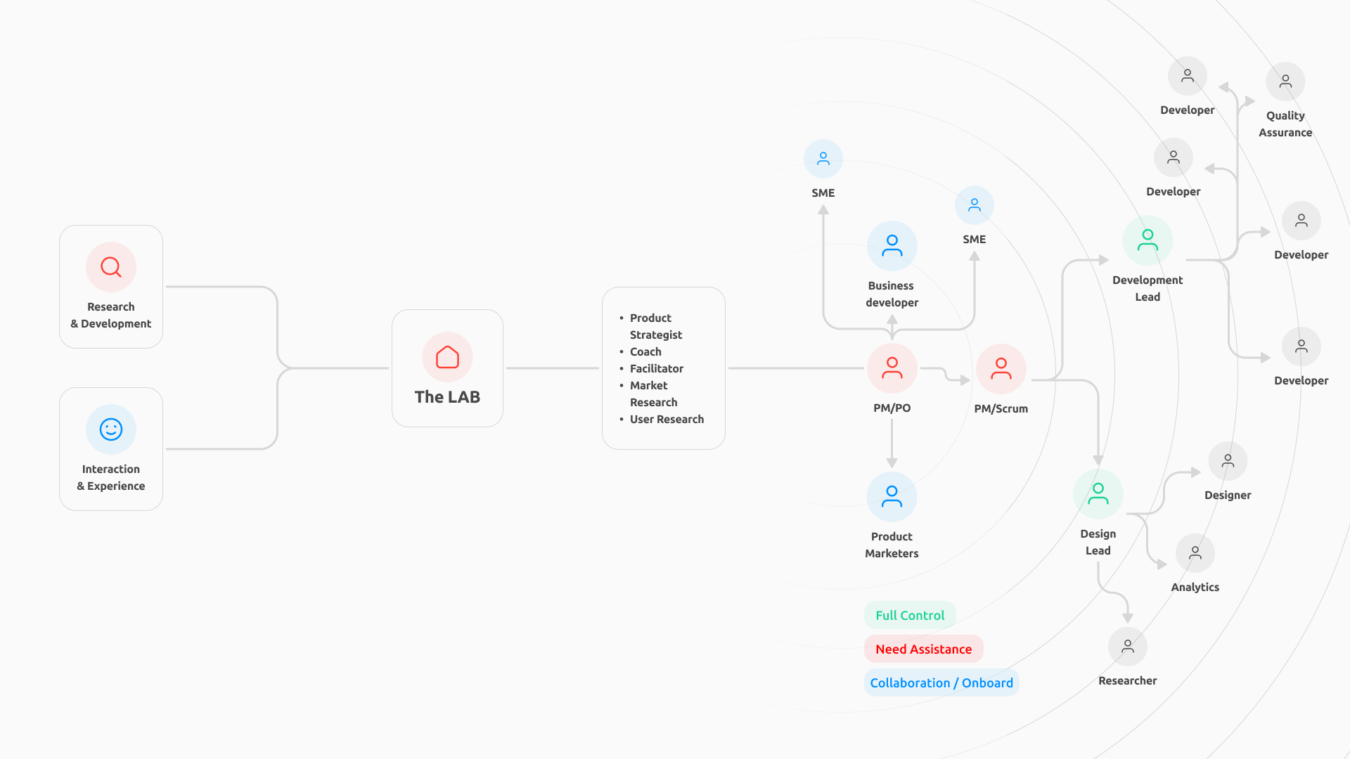
Role & Team
As Product Design Lead, I:
- Led the sprint across design, brand, and content
- Worked with designers, strategists, and copywriters
- Presented a full rebrand and product vision to C-level stakeholders
Approach
- Ran a quick audit of the current app and brand materials
- Interviewed internal stakeholders to understand missed opportunities
- Restructured the user journey around key moments (request, top-up, save, spend)
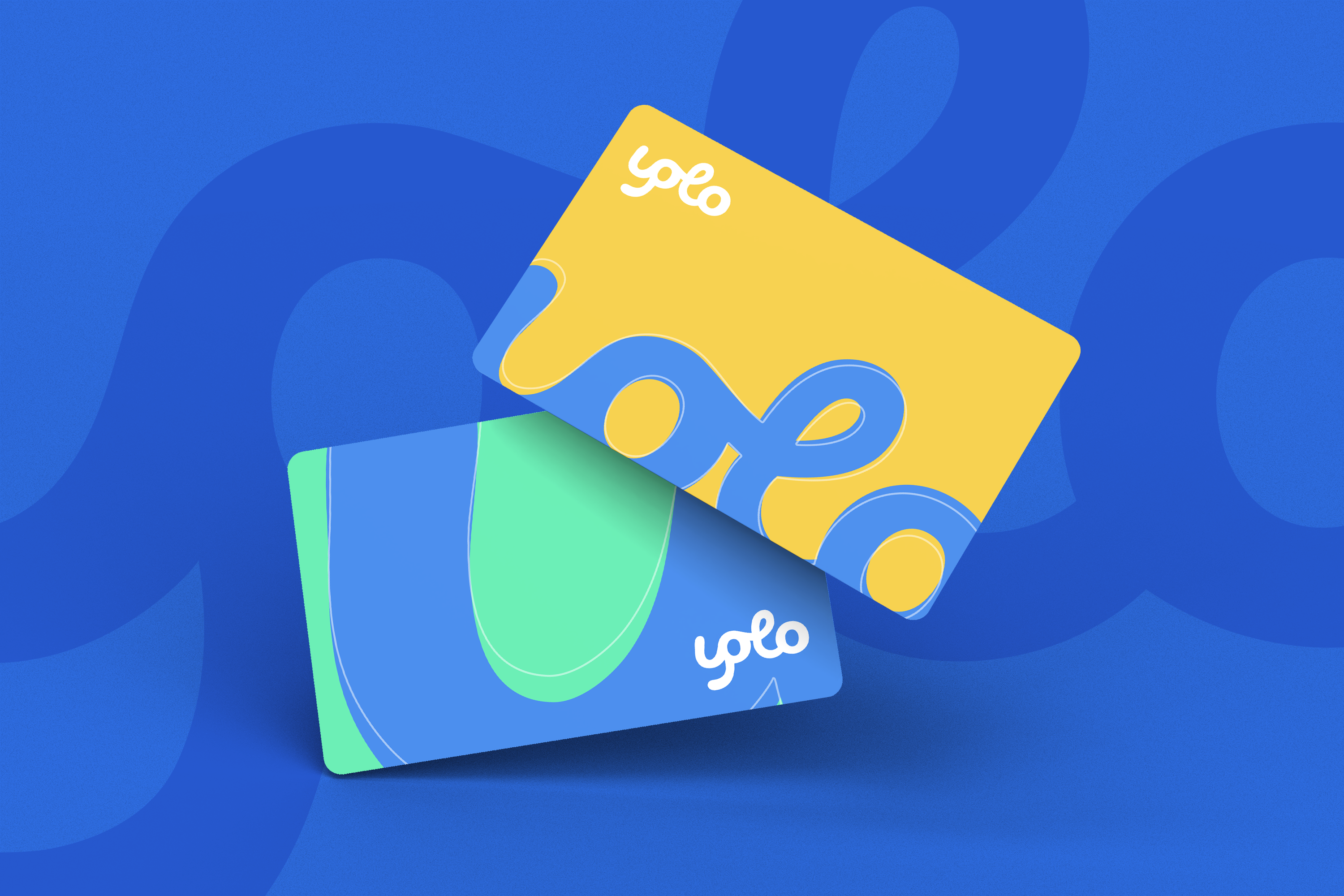
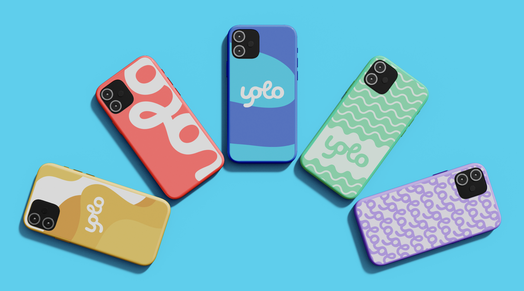
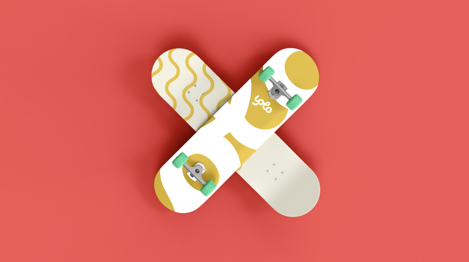
- Developed a new visual identity, tone, and brand DNA
- Defined separate experiences for teens and parents to increase clarity
Challenges
- Product positioning was vague and overlapped with other apps
- Needed to balance fun and trust (youth brand vs. financial tool)
- Compressed timeline to build everything in 1 week
Solution
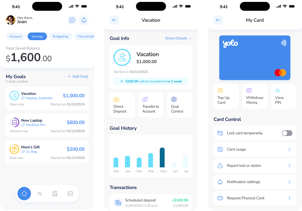
- New color system, typography, and tone focused on teen confidence
- Feature set simplified to help teens learn, earn, and spend
- Parent interface positioned as control + trust—not monitoring
- Proposed a tiered product roadmap: start small, grow smart
Results & Impact
- New concept resonated with both internal and test users
- Differentiated YOLO from areeba Pay and Zaky
- Project was deprioritized due to company strategy shift—but pitch is reusable
What I’d Do Differently
I’d bring real teens into the room earlier—not just as testers, but as co-creators. Designing for Gen Z is one thing, but designing with them is what makes it stick.
Want the full
Deck?
Here’s a deck to walk you through how we reimagined Yolo
Yolo Reimagined deck

Phone number
+961 3 139 572
© 2026 Johnny Bou Malhab. All Rights Reserved
Reimagining
Yolo
A Gen Z financial app that actually feels Gen Z
Client
areeba
Timeline
12 Months
role
Product Design Lead
project
Yolo
TL;DR
I led a full rebrand and product redesign for YOLO, transforming it from a generic wallet into a Gen Z-first financial tool. Although it wasn’t launched, it became a benchmark for what youth-focused design could look like.
Summary
YOLO was supposed to be a wallet for teens, but it lacked identity and relevance. I led a 1-week design sprint to completely reimagine its brand, UX, and product strategy to make it resonate with both teens and parents—and position it for long-term retention.
Problem Framing
The existing product felt generic and outdated. It didn’t speak to Gen Z visually, emotionally, or functionally. There was no clear parent-child dynamic, and the brand felt more fintech than fun. Internally, no one was proud of it—and usage showed.
- Poor visual identity and irrelevant tone of voice
- Confusing features and no clear product narrative
- No differentiation from existing areeba products
Role & Team
As Product Design Lead, I:
- Led the sprint across design, brand, and content
- Worked with designers, strategists, and copywriters
- Presented a full rebrand and product vision to C-level stakeholders
Approach
- Ran a quick audit of the current app and brand materials
- Interviewed internal stakeholders to understand missed opportunities
- Restructured the user journey around key moments (request, top-up, save, spend)
- Developed a new visual identity, tone, and brand DNA
- Defined separate experiences for teens and parents to increase clarity
Challenges
- Product positioning was vague and overlapped with other apps
- Needed to balance fun and trust (youth brand vs. financial tool)
- Compressed timeline to build everything in 1 week
Solution
- New color system, typography, and tone focused on teen confidence
- Feature set simplified to help teens learn, earn, and spend
- Parent interface positioned as control + trust—not monitoring
- Proposed a tiered product roadmap: start small, grow smart
Results & Impact
- New concept resonated with both internal and test users
- Differentiated YOLO from areeba Pay and Zaky
- Project was deprioritized due to company strategy shift—but pitch is reusable
What I’d Do Differently
I’d bring real teens into the room earlier—not just as testers, but as co-creators. Designing for Gen Z is one thing, but designing with them is what makes it stick.
Want the full
Deck?
Here’s a deck to walk you through how we reimagined Yolo
Yolo Reimagined deck
Phone number
+961 3 139 572
© 2026 Johnny Bou Malhab. All Rights Reserved


Reimagining
Yolo
A Gen Z financial app that actually feels Gen Z
Client
areeba
Timeline
1 week
role
Product Design Lead
project
Yolo
TL;DR
I led a full rebrand and product redesign for YOLO, transforming it from a generic wallet into a Gen Z-first financial tool. Although it wasn’t launched, it became a benchmark for what youth-focused design could look like.
Summary
YOLO was supposed to be a wallet for teens, but it lacked identity and relevance. I led a 1-week design sprint to completely reimagine its brand, UX, and product strategy to make it resonate with both teens and parents—and position it for long-term retention.
Problem Framing
The existing product felt generic and outdated. It didn’t speak to Gen Z visually, emotionally, or functionally. There was no clear parent-child dynamic, and the brand felt more fintech than fun. Internally, no one was proud of it—and usage showed.
- Poor visual identity and irrelevant tone of voice
- Confusing features and no clear product narrative
- No differentiation from existing areeba products
Role & Team
As Product Design Lead, I:
- Led the sprint across design, brand, and content
- Worked with designers, strategists, and copywriters
- Presented a full rebrand and product vision to C-level stakeholders
Approach
- Ran a quick audit of the current app and brand materials
- Interviewed internal stakeholders to understand missed opportunities
- Restructured the user journey around key moments (request, top-up, save, spend)
- Developed a new visual identity, tone, and brand DNA
- Defined separate experiences for teens and parents to increase clarity
Challenges
- Product positioning was vague and overlapped with other apps
- Needed to balance fun and trust (youth brand vs. financial tool)
- Compressed timeline to build everything in 1 week
Solution
- New color system, typography, and tone focused on teen confidence
- Feature set simplified to help teens learn, earn, and spend
- Parent interface positioned as control + trust—not monitoring
- Proposed a tiered product roadmap: start small, grow smart
Results & Impact
- New concept resonated with both internal and test users
- Differentiated YOLO from areeba Pay and Zaky
- Project was deprioritized due to company strategy shift—but pitch is reusable
What I’d Do Differently
I’d bring real teens into the room earlier—not just as testers, but as co-creators. Designing for Gen Z is one thing, but designing with them is what makes it stick.
Want the full
Deck?
Here’s a deck to walk you through how we reimagined Yolo
Yolo Reimagined deck
johnny@monochrome.digital
Phone number
+961 3 139 572
© 2026 Johnny Bou Malhab. All Rights Reserved