


Redesigning
areeba Pay
Helping areeba reduce support tickets by 90% through a redesigned card companion app
Client
areeba
Timeline
3-4 Months
role
Product Design Lead
project
areeba Pay
TL;DR
We redesigned areeba Pay from the ground up to solve performance, UX, and scalability issues. By applying a new design system and rebuilding key flows.
-90%
Help tickets dropped
+60%
App performance improved
100%
Fully white-label ready
Summary
I led the full redesign of areeba Pay—an outdated and buggy wallet app—into a fast, scalable, and white-label-ready product. The redesign reduced help tickets by 90%, boosted performance by 60%, and laid the foundation for expansion through partners.
Problem Framing
The app was slow, visually outdated, and suffered from UX friction. Users frequently submitted support tickets, and partners found it hard to customize the interface. We needed a more reliable, scalable, and modern payment experience.
- 90% of tickets were related to performance or unclear flows
- The UI was inconsistent with areeba's evolving design language
- Partners needed modularity for white-label rollout
Role & Team
As Product Design Lead, I:\
- Directed the redesign effort end-to-end
- Led a team of 2 product designers and 2 UX researchers
- Worked closely with the product owner, engineering, and QA
Approach
- Audited existing UI and gathered data from support logs
- Interviewed users to map pain points
- Applied Asterisk, our in-house design system, to ensure consistency
- Restructured the app architecture around core flows (e.g., view card, freeze, track spending)
Challenges
- We had to rebuild design logic without disrupting backend logic
- Limited analytics visibility made prioritization harder
- Needed to design for both B2C and white-label partner use cases
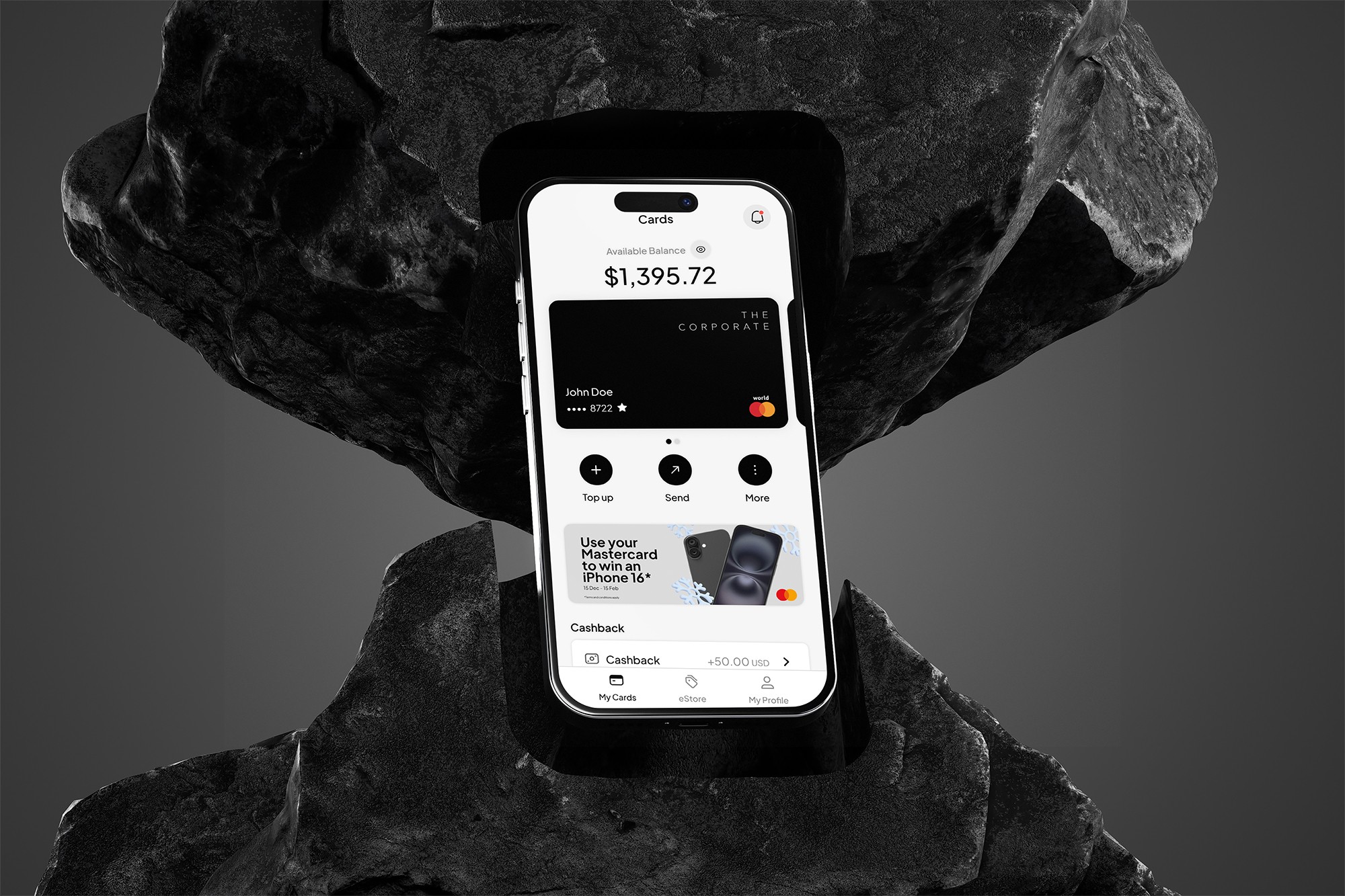
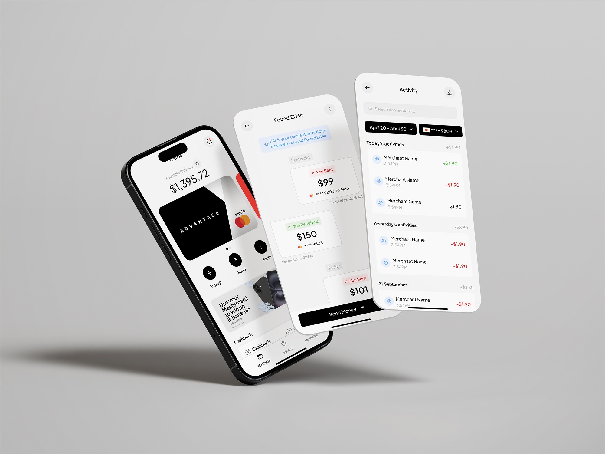
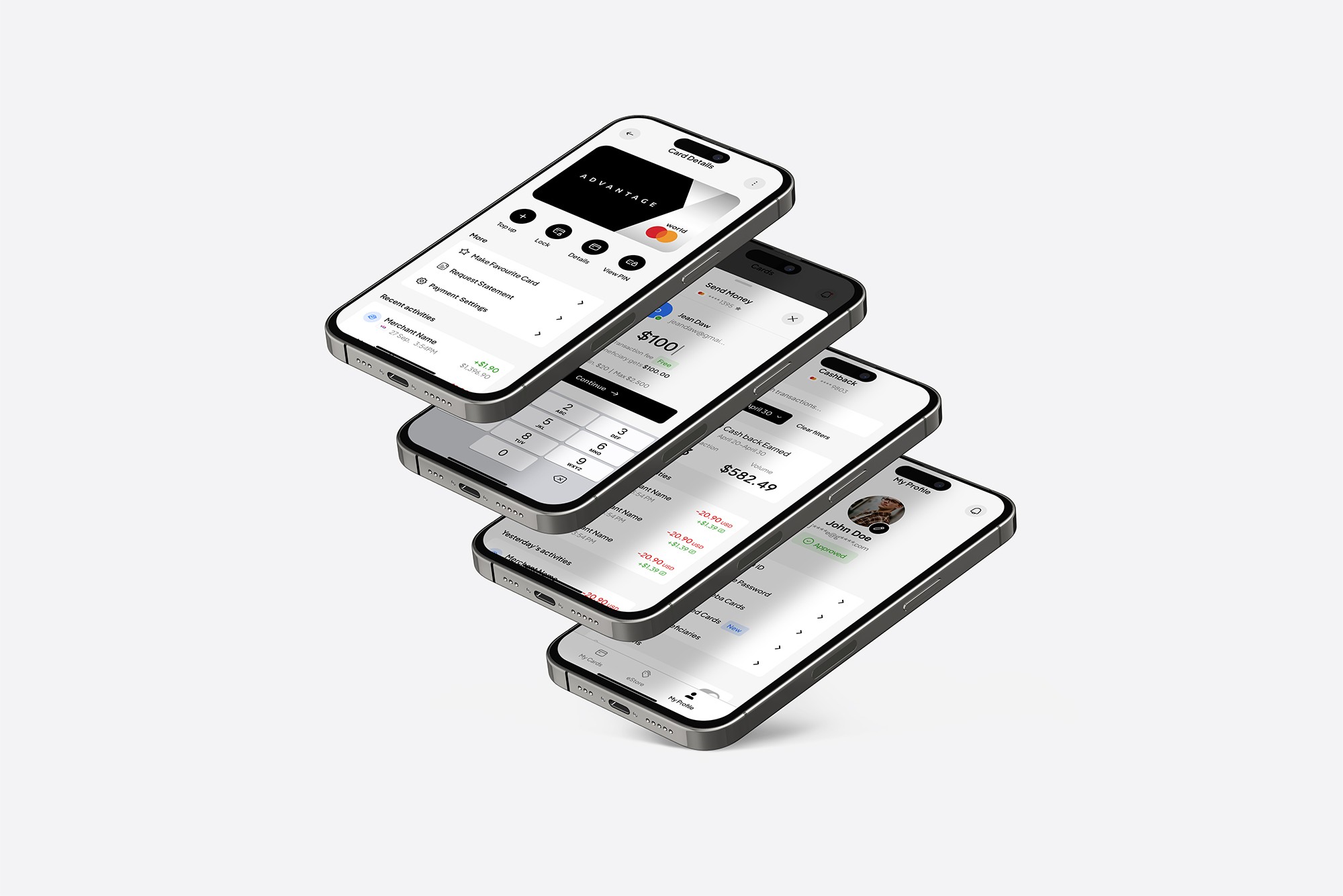
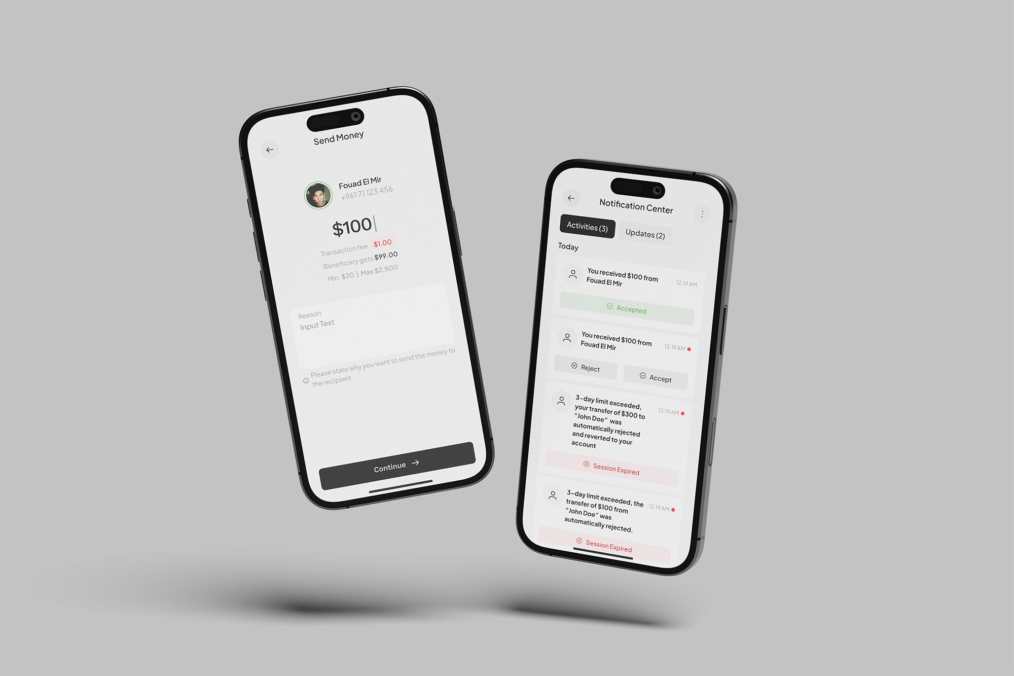
Solution
- Rebuilt the information architecture from scratch
- Introduced a modular component system for white-label customization
- Simplified navigation and reworded actions for clarity
- Improved onboarding and feedback mechanisms
Results & Impact
- 90% reduction in support tickets
- 60% improvement in app responsiveness
- Successfully rolled out to white-label partners with minimal customization friction
What I’d Do Differently
I’d bring engineers earlier into usability testing sessions to help translate friction directly into code-level decisions. That collaboration improves speed and clarity during dev.
Phone number
+961 3 139 572
© 2026 Johnny Bou Malhab. All Rights Reserved
Redesigning
areeba Pay
Helping areeba reduce support tickets by 90% through a redesigned card companion app
Client
areeba
Timeline
3-4 Months
role
Product Design Lead
project
areeba Pay
TL;DR
We redesigned areeba Pay from the ground up to solve performance, UX, and scalability issues. By applying a new design system and rebuilding key flows.
-90%
Help tickets dropped
+60%
App performance improved
100%
Fully white-label ready
Summary
I led the full redesign of areeba Pay—an outdated and buggy wallet app—into a fast, scalable, and white-label-ready product. The redesign reduced help tickets by 90%, boosted performance by 60%, and laid the foundation for expansion through partners.
Problem Framing
The app was slow, visually outdated, and suffered from UX friction. Users frequently submitted support tickets, and partners found it hard to customize the interface. We needed a more reliable, scalable, and modern payment experience.
- 90% of tickets were related to performance or unclear flows
- The UI was inconsistent with areeba's evolving design language
- Partners needed modularity for white-label rollout
Role & Team
As Product Design Lead, I:\
- Directed the redesign effort end-to-end
- Led a team of 2 product designers and 2 UX researchers
- Worked closely with the product owner, engineering, and QA
Approach
- Audited existing UI and gathered data from support logs
- Interviewed users to map pain points
- Applied Asterisk, our in-house design system, to ensure consistency
- Restructured the app architecture around core flows (e.g., view card, freeze, track spending)
Challenges
- We had to rebuild design logic without disrupting backend logic
- Limited analytics visibility made prioritization harder
- Needed to design for both B2C and white-label partner use cases
Solution
- Rebuilt the information architecture from scratch
- Introduced a modular component system for white-label customization
- Simplified navigation and reworded actions for clarity
- Improved onboarding and feedback mechanisms
Results & Impact
- 90% reduction in support tickets
- 60% improvement in app responsiveness
- Successfully rolled out to white-label partners with minimal customization friction
What I’d Do Differently
I’d bring engineers earlier into usability testing sessions to help translate friction directly into code-level decisions. That collaboration improves speed and clarity during dev.
Phone number
+961 3 139 572
© 2026 Johnny Bou Malhab. All Rights Reserved


Redesigning
areeba Pay
Helping areeba reduce support tickets by 90% through a redesigned card companion app
Client
areeba
Timeline
3-4 Months
role
Product Design Lead
project
areeba Pay
TL;DR
We redesigned areeba Pay from the ground up to solve performance, UX, and scalability issues. By applying a new design system and rebuilding key flows.
-90%
Help tickets dropped
+60%
App performance improved
100%
Fully white-label ready
Summary
I led the full redesign of areeba Pay—an outdated and buggy wallet app—into a fast, scalable, and white-label-ready product. The redesign reduced help tickets by 90%, boosted performance by 60%, and laid the foundation for expansion through partners.
Problem Framing
The app was slow, visually outdated, and suffered from UX friction. Users frequently submitted support tickets, and partners found it hard to customize the interface. We needed a more reliable, scalable, and modern payment experience.
- 90% of tickets were related to performance or unclear flows
- The UI was inconsistent with areeba's evolving design language
- Partners needed modularity for white-label rollout
Role & Team
As Product Design Lead, I:\
- Directed the redesign effort end-to-end
- Led a team of 2 product designers and 2 UX researchers
- Worked closely with the product owner, engineering, and QA
Approach
- Audited existing UI and gathered data from support logs
- Interviewed users to map pain points
- Applied Asterisk, our in-house design system, to ensure consistency
- Restructured the app architecture around core flows (e.g., view card, freeze, track spending)
Challenges
- We had to rebuild design logic without disrupting backend logic
- Limited analytics visibility made prioritization harder
- Needed to design for both B2C and white-label partner use cases
Solution
- Rebuilt the information architecture from scratch
- Introduced a modular component system for white-label customization
- Simplified navigation and reworded actions for clarity
- Improved onboarding and feedback mechanisms
Results & Impact
- 90% reduction in support tickets
- 60% improvement in app responsiveness
- Successfully rolled out to white-label partners with minimal customization friction
What I’d Do Differently
I’d bring engineers earlier into usability testing sessions to help translate friction directly into code-level decisions. That collaboration improves speed and clarity during dev.
johnny@monochrome.digital
Phone number
+961 3 139 572
© 2026 Johnny Bou Malhab. All Rights Reserved